Project Overview
Introduction:
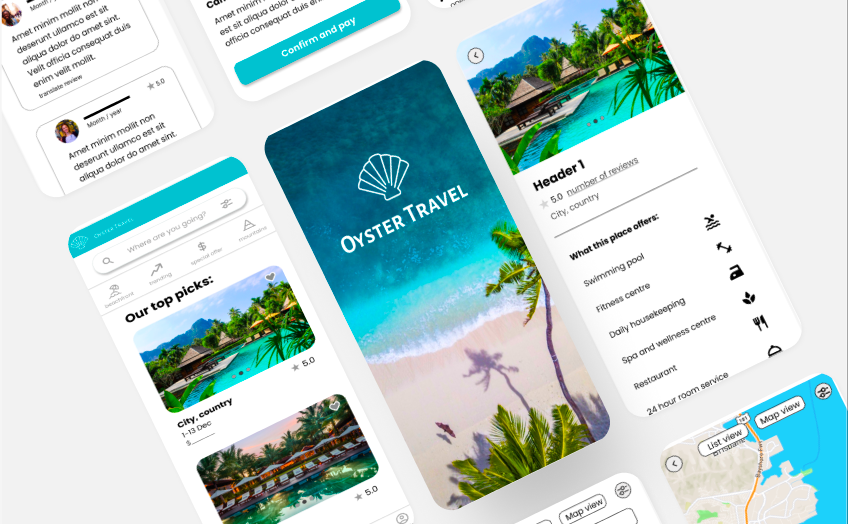
As a UX designer who has completed the Google UX design certificate program, I had the opportunity to create a new hotel booking app from scratch. The app, called Oyster Travel, was designed to save users time and effort when booking a hotel by offering the right information in an easily digestible manner. Inspired by the quote 'The world is your oyster', Oyster Travel is designed for users who want to tick off the next destination on their bucket list.
The Problem:
Looking for a hotel can be an overwhelming experience. No matter what your budget is, it can often be tiring and time-consuming to find the perfect place to stay. This can lead to frustration and ultimately a poor user experience.
The Goal:
The goal of the project was to create a new hotel booking app that would save users time and effort when booking a hotel. This was achieved by offering the right information in an easily digestible manner. The app was designed to be user-friendly, intuitive, and enjoyable to use.
My Responsibilities:
My responsibilities included conducting user research, creating wireframes, prototyping, usability testing, and visual design. I also had to ensure that the app was user-friendly, intuitive, and provided users with all the necessary information.
Understanding the User
User Research Summary:
I conducted extensive research to ensure the app would meet the needs and preferences of users. This research consisted of a competitive audit, user interviews, and quantitative research.
Interview Questions:
- Could you describe your experience of booking holidays online?
- What kind of frustrations do you experience when using online travel websites?
- How do you decide where to go on your next holiday?
- How do you decide where to stay? Which features do you look for?
- Apart from a hotel, what other services do you book/use when you travel?
- Which app/website do you use to book travel? Why?
Main Takeaways from User Interviews:
The user interviews were extremely eye-opening, and I was able to identify the four pain points below as a result. 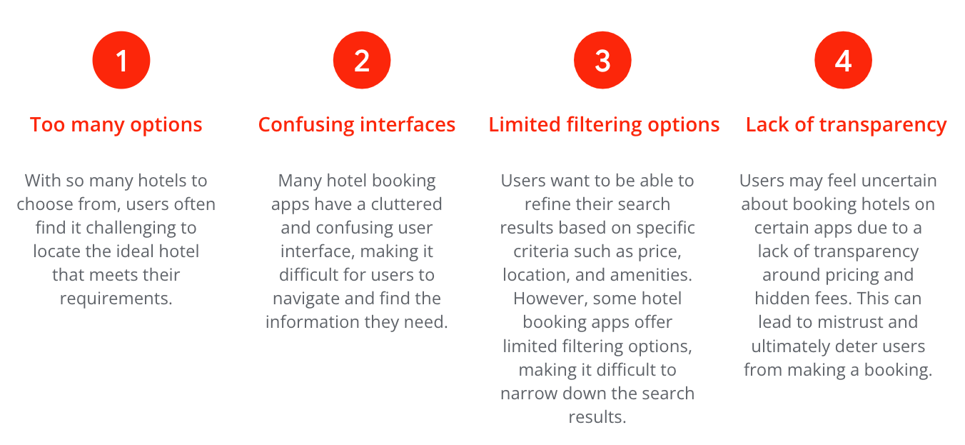
User Personas:
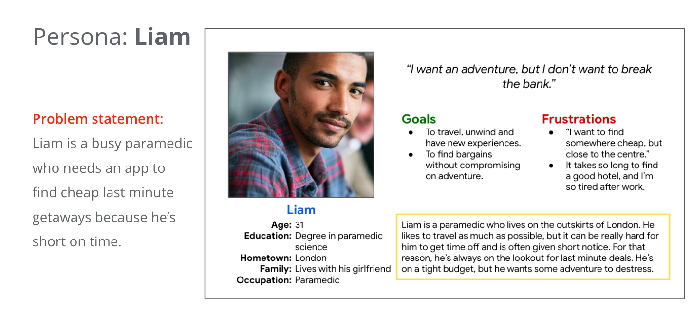
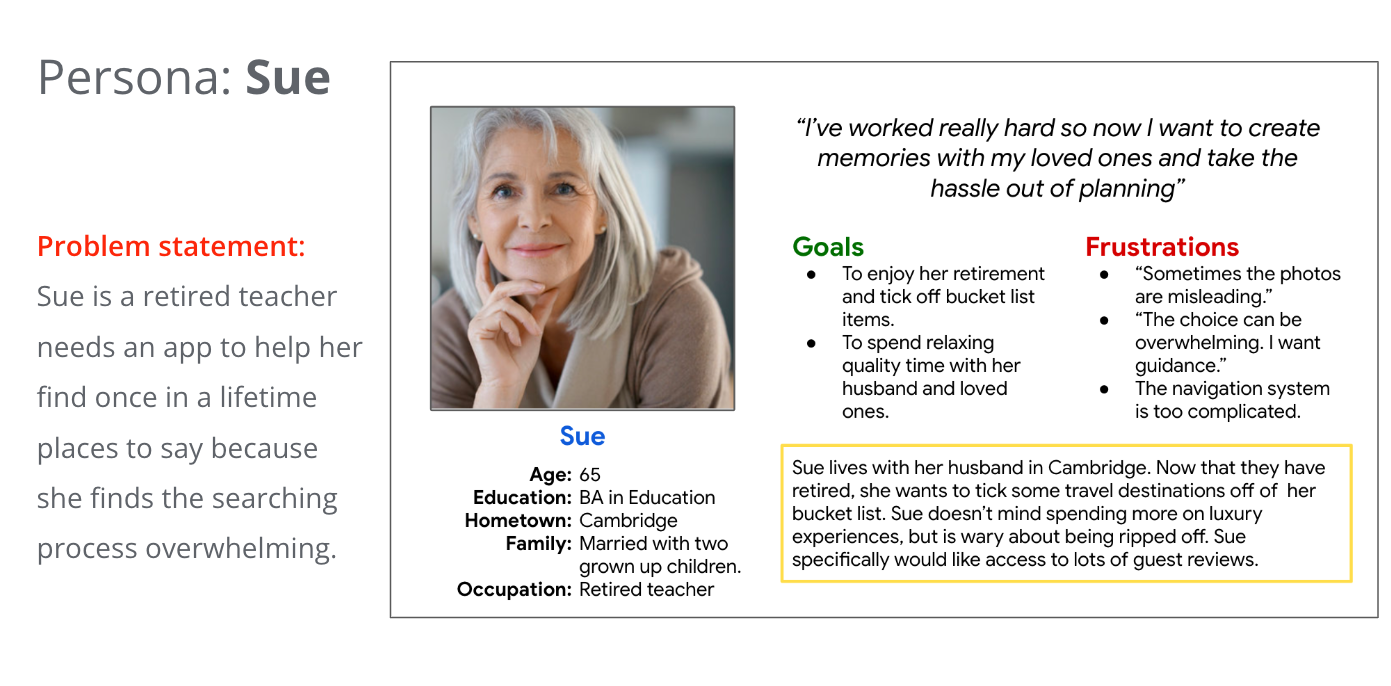
Based on the user research, I created user personas to represent the target audience. The user personas helped me to keep the user's needs and preferences in mind when designing the app.
User Journey:
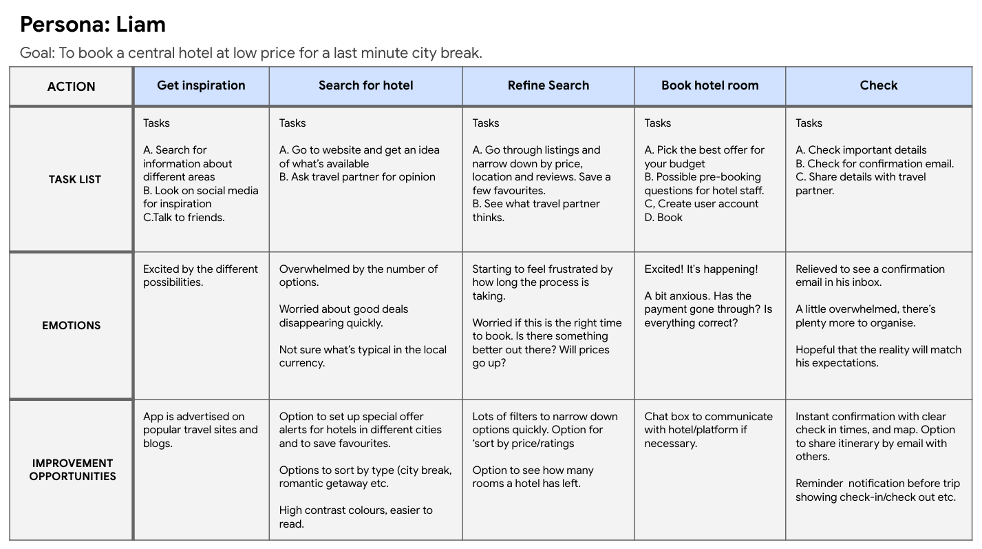
I then created a user journey to map out the user's experience when using the app. This helped me to identify pain points and areas for improvement.
Competitive Audit:
To understand the competitive landscape, I conducted a competitive audit of Expedia, Hotels.com, AirBnb and Booking.com. I compared the purchasing experience of each competitor’s app and desktop website as a new user.
Ideation:
Using the insights gained from user research and the competitive audit, I conducted a "How Might We" exercise and Crazy Eights to generate ideas for the app's design.
Starting the Design
Paper Wireframes:
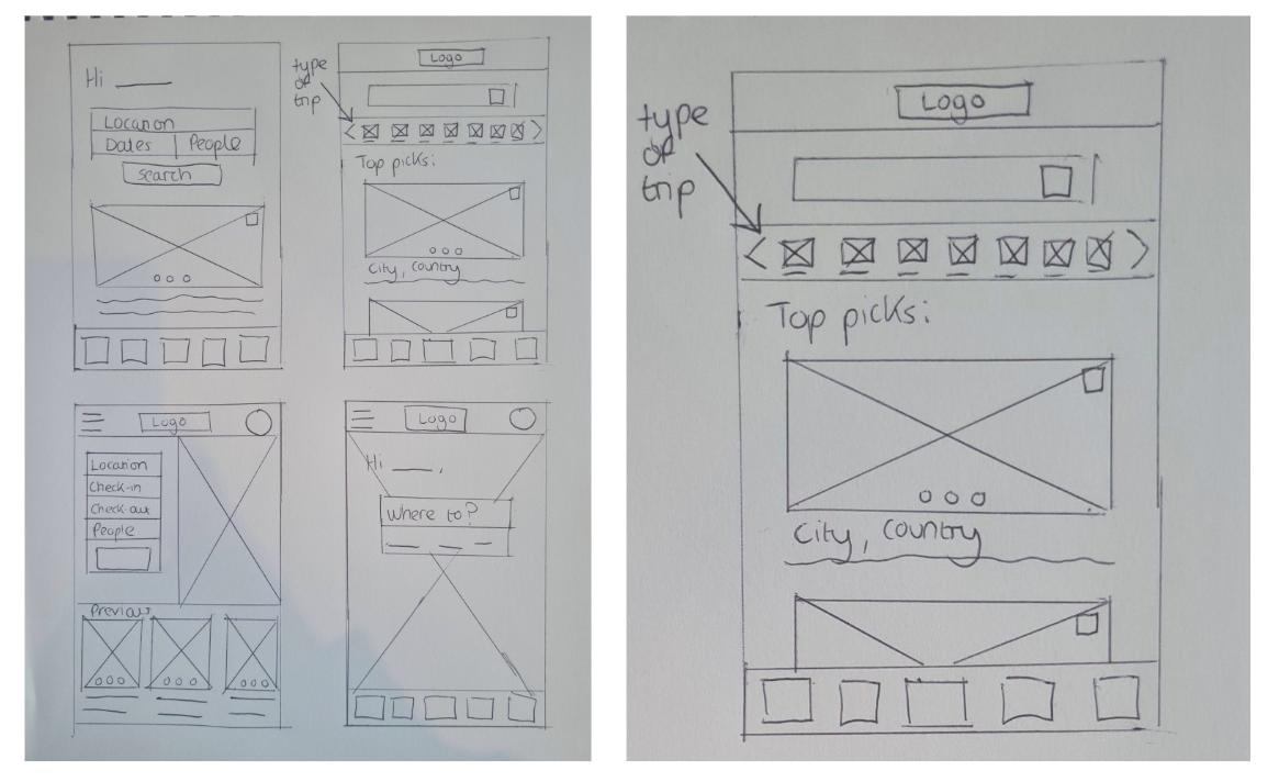
To visualise the user interface, I created paper wireframes that allowed me to quickly iterate and make changes based on user feedback. This helped me test out different design ideas and ensure that the app's functionality was clear and easy to understand. I decided that the design in the top-right corner was my favourite because I could create icons and allow users to scroll according to which type of trip they were taking (beach break, camping holiday, ski holiday, etc.).
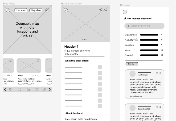
Digital Wireframes:
Low Fidelity Prototype:
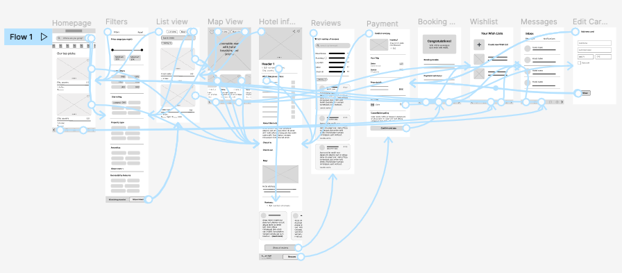
Using the paper wireframes, I created a low-fidelity prototype that allowed me to test the app's functionality and usability. This prototype was tested with users to identify any issues and make necessary improvements. You can try it with this link.
Usability Study:
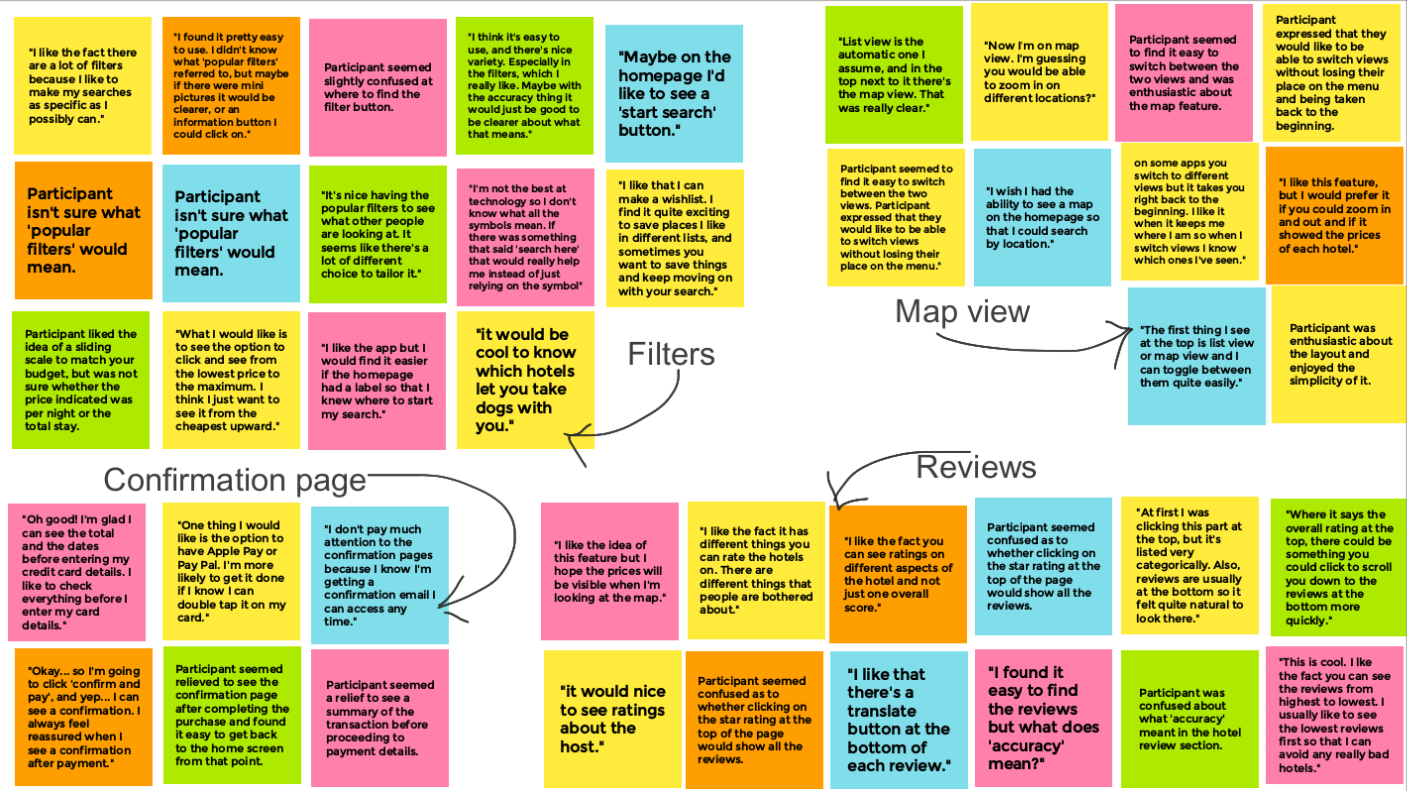
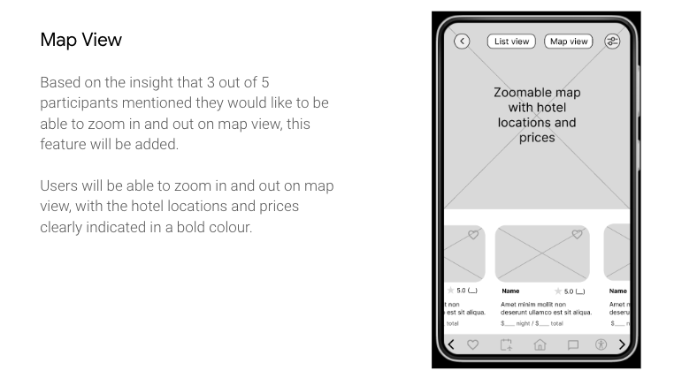
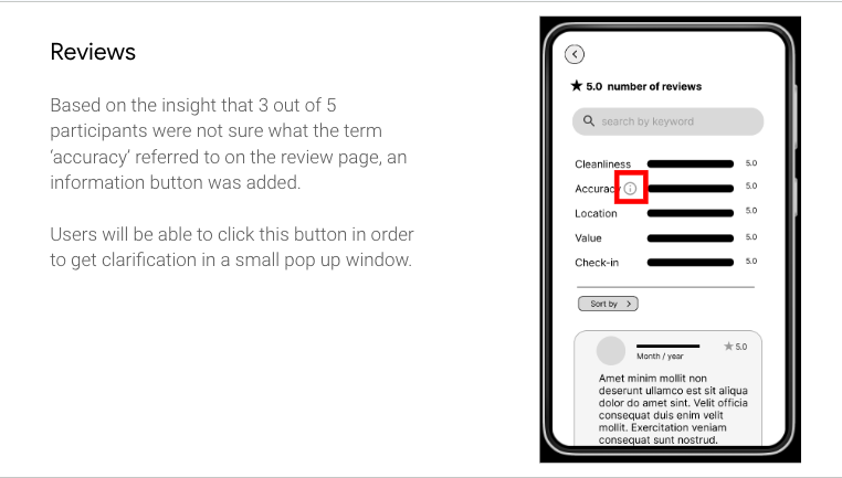
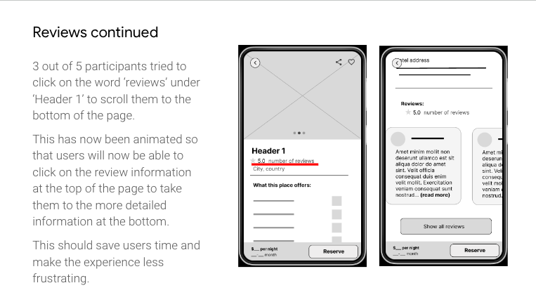
I conducted usability testing to evaluate the effectiveness of the low-fidelity prototype. Based on the feedback I received, I made an affinity map to find themes in the research. For more in depth analysis please see my research presentation
Iterations:
Refining the Design
Visual Design:
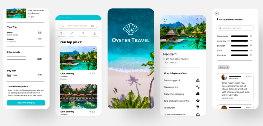
I chose warm turquoise tones for a calming feel associated with travel, and Poppins font for its modern and legible design. The font has a friendly and approachable feel, which aligns with the travel app's aim of providing a smooth and enjoyable travel experience. Its rounded letterforms and generous x-height make it highly legible, which is essential for an app that contains a lot of text.
I hope that the use of white space and the minimal colour palette would create a clean and easy-to-navigate aesthetic that aligns with the travel app's aim of providing a stress-free travel experience. 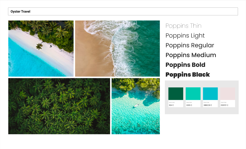
Mock Ups:
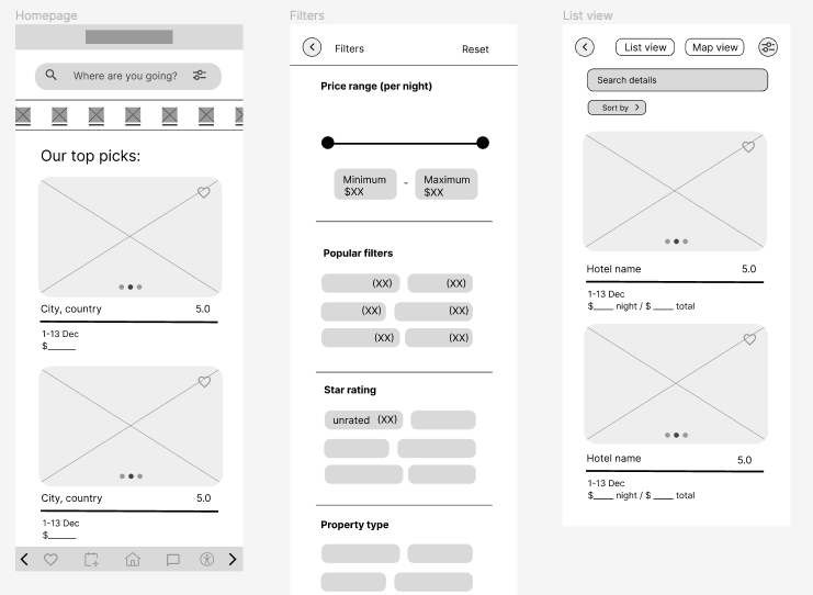
After making changes based on the low-fidelity prototype and usability testing, I created high-fidelity mockups that showed the final design of the app.
High Fidelity Prototype:
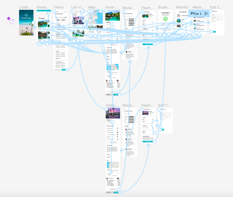
You can view the high fidelity prototype using this link
Accessibility Considerations:
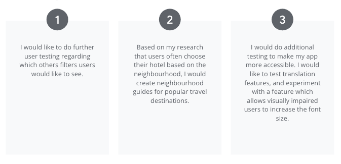
Going Forward
Takeaways
Impact:
Through user testing, I received feedback such as "I would be able to quickly find the perfect hotel for my needs" and "the filters would make it easy to narrow down my search." These comments demonstrate the value of designing with the user in mind and creating intuitive interfaces that save users time and frustration.
What I learned:
My first UX design portfolio project provided me with invaluable learning experiences. I learned that conducting usability studies is essential to achieving a user-centred design, especially when you're too close to the problem.
Next Steps
