Project Overview
Introduction:
The Sheriffs' and Recorder's Fund is a charity organisation that provides support and grants to prison leavers in London to help with their rehabilitation. The organisation also offers large grants to prison-based charitable schemes that work towards the rehabilitation of prison leavers.
The Problem:
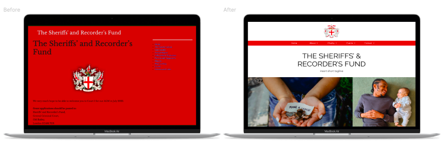
The Sheriffs' and Recorder's Fund website was outdated, difficult to navigate, and lacked accessibility features. It was also challenging for supporters to keep up-to-date with fundraising events and donations, and the website did not adequately showcase the impact of the charity's work. Not only that, but case workers found it difficult to find information when it came to applying for grants for their service users. The organisation needed a redesign of the website to better serve its users and achieve its goals.
My Role:
As the UX designer, I was responsible for leading the redesign project from start to finish. My responsibilities included conducting user research, creating user personas and journey maps, ideating, sketching, and designing the website's wireframes, conducting usability tests, and producing high-fidelity mockups.
Understanding the User
User Research Summary:
I conducted user interviews with probation officers, case workers, and support workers who applied for support on behalf of prison leavers. I also spoke with supporters of the charity and charity staff.
Interview Questions:
Case workers / probation officers:
- Can you tell me a bit about your connection to the Sheriffs’ & Recorder’s Fund?
- Can you talk me through what you do when you apply for a grant?
- What barriers do your service users typically face when applying for grants or accessing support?
- What are some of the frustrations you face when seeking help for your service users?
- How can the S&R website better support you when applying for grants on behalf of your service users?
Supporters:
- Can you tell me about your involvement with the Sheriffs’ & Recorder’s Fund?
- Have you donated to other charities before? If so, what sets the Sheriffs’ & Recorder’s Fund apart from other charities?
- How do you use the S&R website?
- What do you want the public to know? What’s the achievement you would most like to highlight?
- Can you talk me through the process of making a donation?
Main Takeaways from User Interviews:
The user interviews were extremely eye-opening, and I was able to identify the four pain points below as a result.
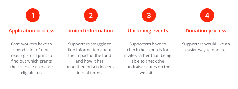
I was also able to learn about some design limitations. My initial reaction to the application process pain point was to ask the fund’s staff whether an online form would be possible, which I found out was not something that they would want because they didn’t want prison leavers to apply for financial help directly.
User Personas:
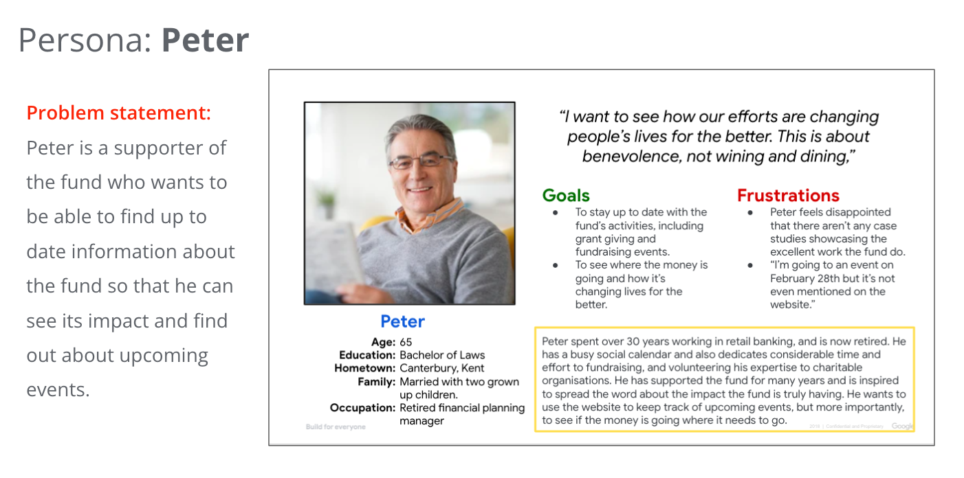
Based on the user research, I created user personas to represent the key users of the website. These personas helped me to design the website to meet the specific needs of each user type.

Competitive Audit:
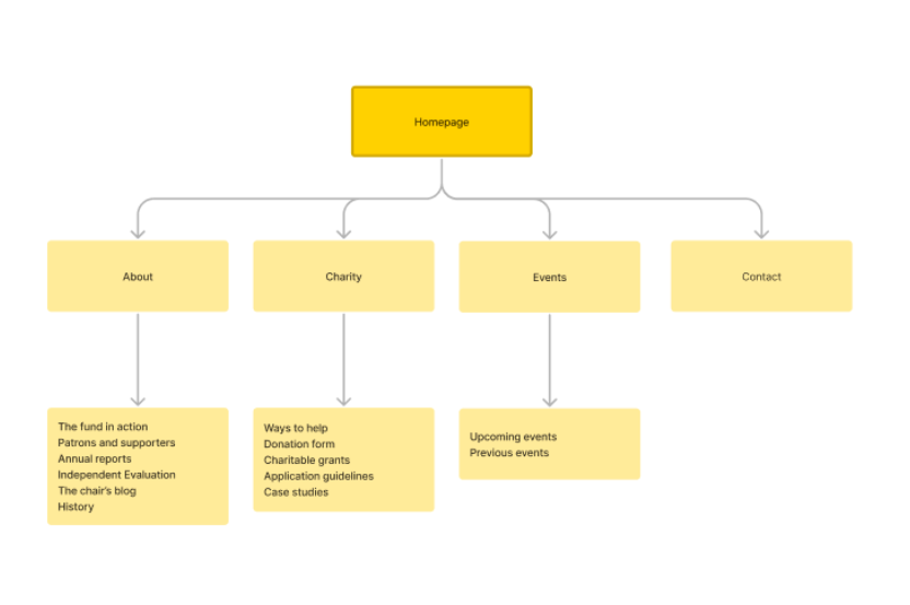
I conducted a competitive audit of livery companies who also provide support to similar service users and of prison charities. This helped us to identify best practices and areas for improvement in the Sheriffs' and Recorder's Fund website. This was particularly useful when it came to making a site map.
Site Map:
Ideation:
I used ideation techniques such as "How Might We" and Crazy Eights to generate ideas for the website redesign. This ideation process helped me to explore a range of ideas and identify the most promising solutions. Here are some of my initial ideas:
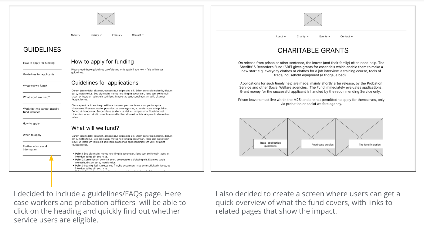
- It needs to be clearer what the fund will and won’t provide grants for. This could be solved by an FAQs page.
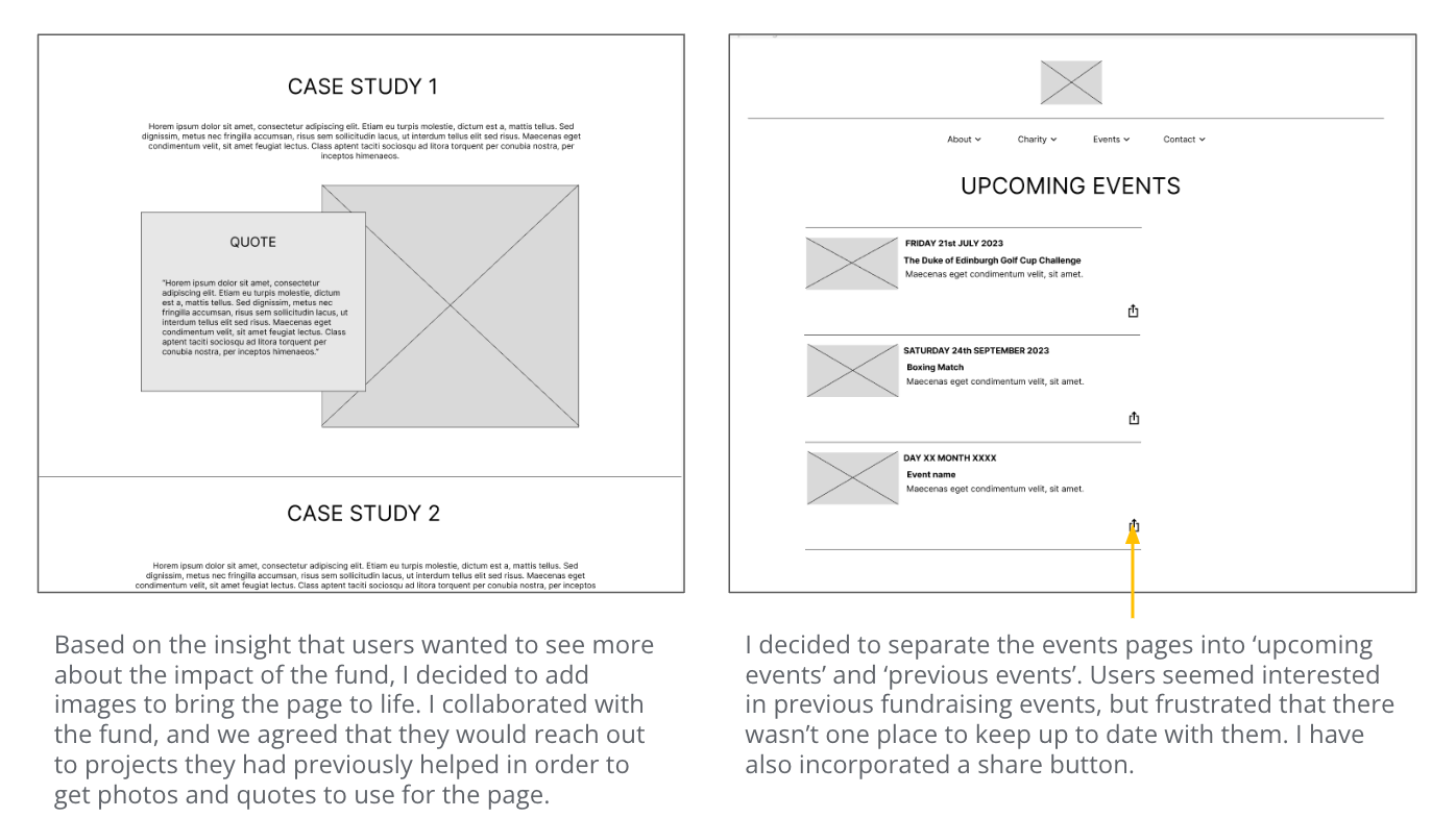
- There should be a case studies page with clear, visual examples rather than a downloadable pdf which is difficult to find. I could also ask the fund to approach partner organisations to get testimonies for the website.
- There should be an ‘upcoming events’ page where supporters can check what’s on and share events with their contracts.
- There could be an online donation form for supporters, and a QR code to make the process easier.
Starting the Design
Paper Wireframes:
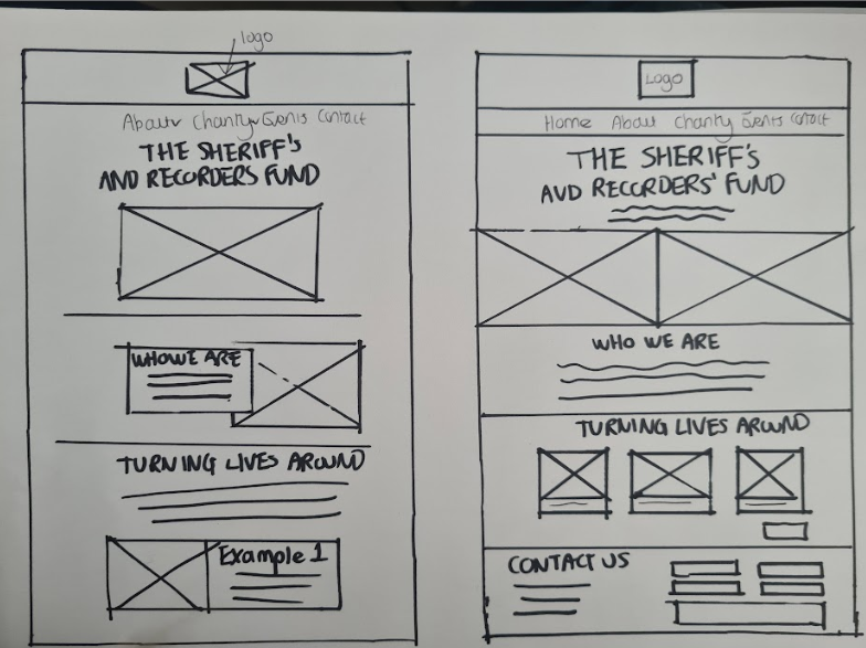
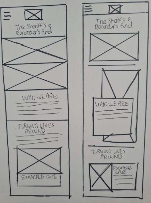
Given that some users felt that the website didn’t reflect the impact the fund really has, I wanted to make the homepage far more visual in order to highlight this aspect. I also wanted ‘who we are’ to be front and centre to make the message even stronger, so I experimented with different layouts.I designed the desktop version first because users I interviewed said that they tended to browse on their laptops rather than use their mobile phones to visit the site, but I also designed with mobiles and tablets in mind. After some experimentation, I decided to go with a tiered-layer cake layout because it was easy to adapt to different devices.
Digital Wireframes:
Low Fidelity Prototype:
I created a low fidelity prototype of the website using Figma. This prototype helped me to test the website's layout, navigation, and functionality. Just as with the paper wireframes, I tried to keep the fund’s mission at the core of the design as many supporters/donors didn’t feel the page represented the great work they do. I also added a contact form at the bottom of the homepage to make it quick and easy for users to ask questions regarding applications or donations.
Please click here to see the low-fidelity prototype.

Usability Study:
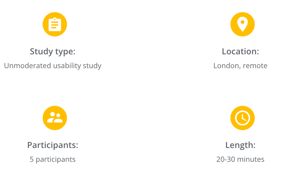
Parameters:
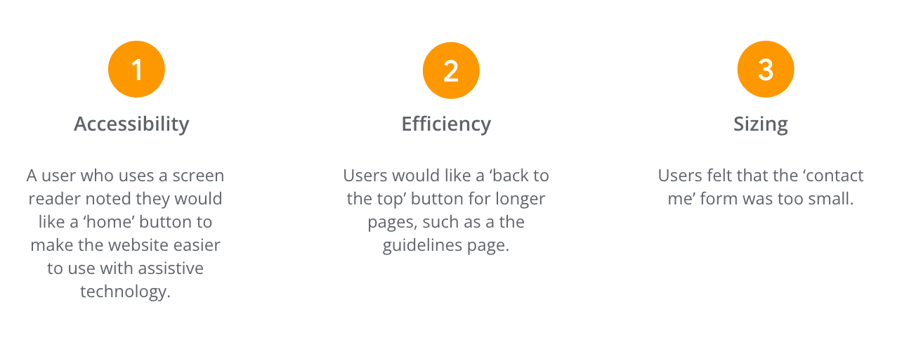
Findings:
Refining the Design
Visual Design:
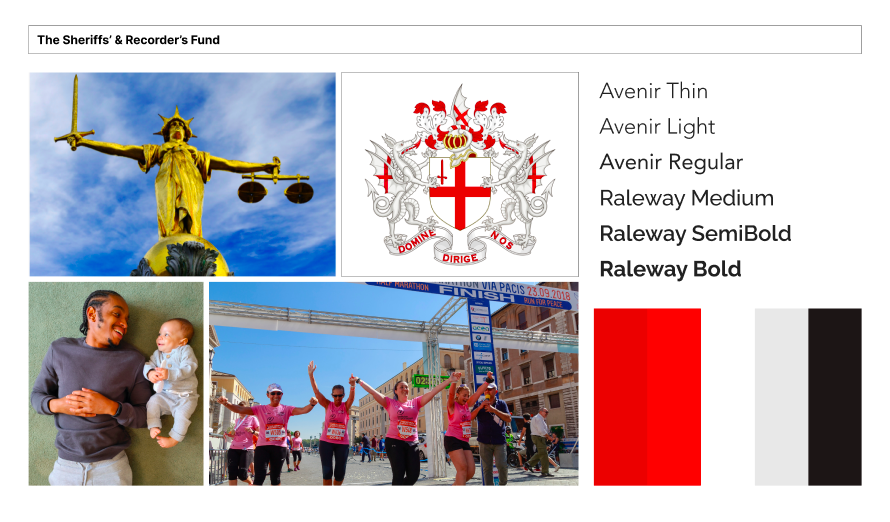
I aimed to create a design that exuded a sense of tradition and trustworthiness, while still appearing modern and approachable.
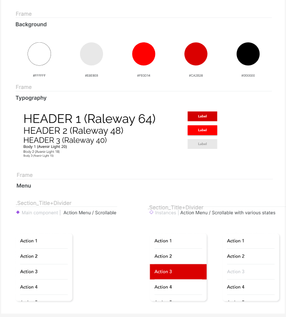
Regarding the colour palette, I chose a classic combination of black, white, and a touch of red to reflect the company's logo.
For the typography, I opted for Avenir as the body text, as I felt that it provided a contemporary, clean, and sleek feel. This sans-serif font is perfect for digital screens as it's easy to read, and its modern look complements the traditional and formal feel of the logo, striking the right balance.
In terms of imagery, I aimed to highlight the company's charitable efforts and commitment to helping prison leavers. However, I faced a challenge in finding suitable photos that respected the privacy and dignity of the individuals they serve. To address this, I worked closely with the charity to obtain explicit permission from specific individuals for the use of their photos, ensuring that their consent was informed and that they were comfortable with my portfolio's intended use. In cases where explicit permission could not be obtained, I relied on stock images to represent the charity's work.
Style Guide:
Mock Ups:
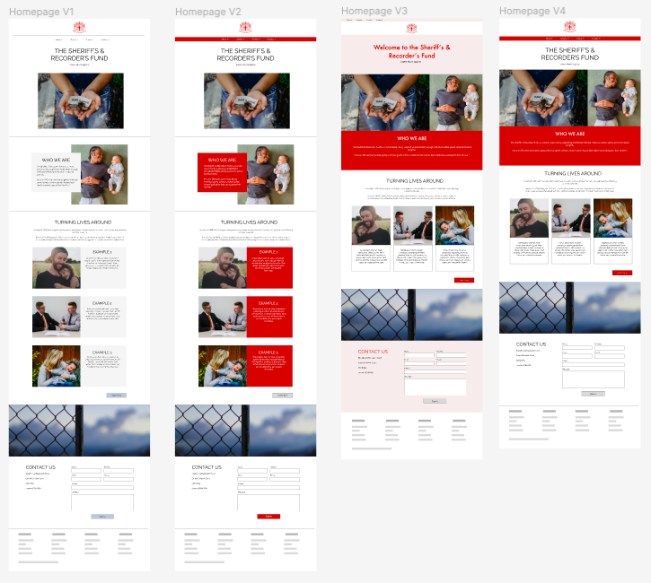
As well as user feedback, I was also fortunate enough to receive stakeholder feedback. My initial design (far left) didn’t include much colour, but after speaking with stakeholders we established that the design needed to include more red to represent the fund’s colours. I experimented with ways of including more red, and then we voted on which best suited the fund’s needs. We went for version 4 (far right) as it seemed very easy to adapt to different devices, and also brightened up the page.
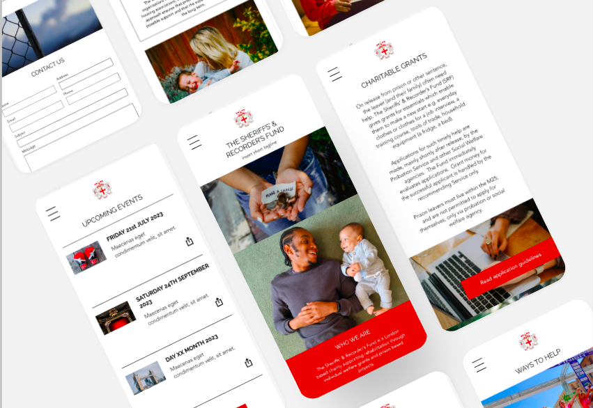
I then adapted the same style to different devices.
Accessibility Considerations:
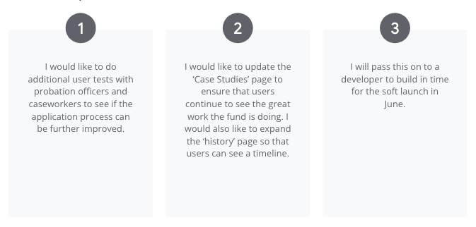
Going Forward
Takeaways
Impact:
Through this UX project, I hope to implement several design changes that had a significant impact on user engagement and satisfaction. For example, I hope that the application guidelines page will save time and effort for probation officers and caseworkers. I also hope that showcasing the fund’s work will encourage further support, and that the changes will make it easier for supporters to donate and keep up to date with events.
What I learned:
I gained valuable insights during the design process:
1. Designing for multiple user groups: One of the biggest challenges was designing for multiple user groups, including those applying for grants, donors, and charity employees processing grants. This required me to consider the needs of each group and create a clear hierarchy of information to make it easy for users to find what they need. It was an enriching experience to consider the product from different angles, and I learned a lot about designing with a user-centric approach.
2. Managing stakeholder expectations: During the project, I gained valuable experience in managing stakeholder expectations. I encountered 'scope creep' as new ideas were introduced in every meeting, which was challenging to handle. However, I effectively managed the expectations by discussing the feasibility of the ideas and prioritizing them based on their impact on the user experience and project timeline.
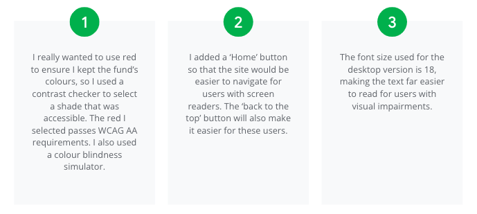
3. Designing with accessibility in mind: I learned the importance of designing with accessibility in mind, as it was crucial to create an inclusive website for all users. When stakeholders requested the use of red to align with the fund's colours, I ensured that it was done in a way that was accessible for users with visual impairments. I used a colour blindness simulator to ensure that the website was easily readable for all users.
In summary, my experience designing the charity website for The Sheriffs' and Recorder's Fund taught me the importance of designing for multiple user groups, managing stakeholder expectations, and designing with accessibility in mind. These learnings will be invaluable as I continue to create user-centric designs for different projects.
Next Steps
